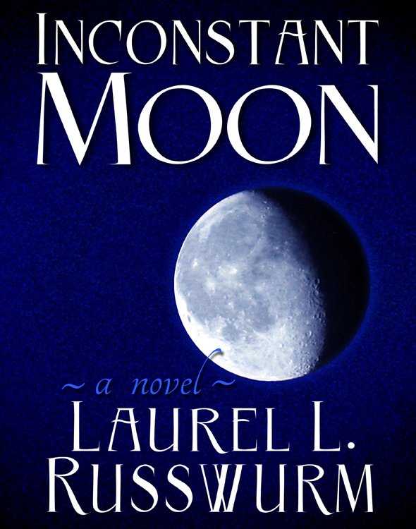
The “Inconstant Moon” cover art required a complete redesign that would show better in eBook form.
I decided to use a high definition photograph of the moon I had taken myself, even though I was advised that the naked human eye isn’t able to see the moon with this level of definition.
Stylistically I was hoping for edgier art than on the print version; what I ended up with has a bit of 1960’s magazine art feel with the requisite touch of the garish. Both the image and the text occupy every inch of the space with an urgency lacking in the more understated print art.
The two covers show different phases of a gibbous moon; when we go ahead with the hard cover version, there will again be new art showing a different phase again, as illustration of the inconstancy of the moon.


